Colors, typefaces, and the look of Boston.gov
First impressions are important, and color and style can make or break your design.
The Berthold Akzidenz Grotesk typeface is used only for our logo.
When the City’s Digital Team and global design firm IDEO thought about what colors to use for Boston.gov, we wanted to honor Boston’s past while acknowledging how far this progressive city has come. Our color palette is a mix of reds, whites, and blues, all contrasted with a modern gray.
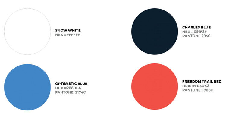
The site’s primary colors — “Freedom Trail Red,” “Charles Blue,” “Optimistic Blue,” and “Snow White” — drive the personality of the site and direct users to important notifications and moments of functionality.
The main colors that make up the redesigned Boston.gov.
Snow White, which is the canvas color for the site, acts as a grounding mechanism for our content. Freedom Trail Red, inspired by the brick-red color of Boston’s Freedom Trail, is meant to draw your attention and is used for extremely important links and buttons. The dark color Charles Blue is for when we want to look more official. Optimistic Blue can inject warmth into our layouts (and can be a little less official).
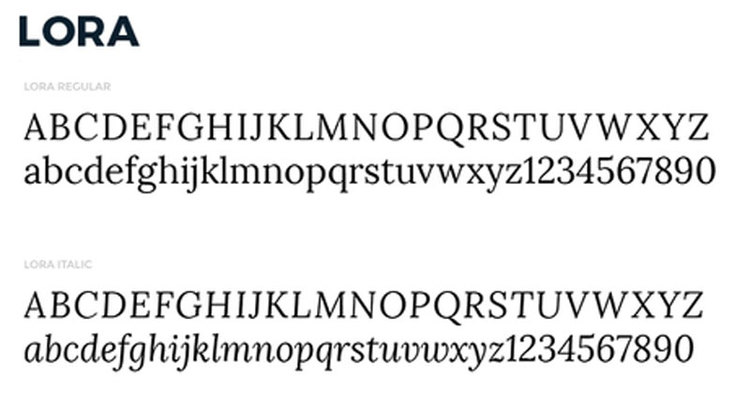
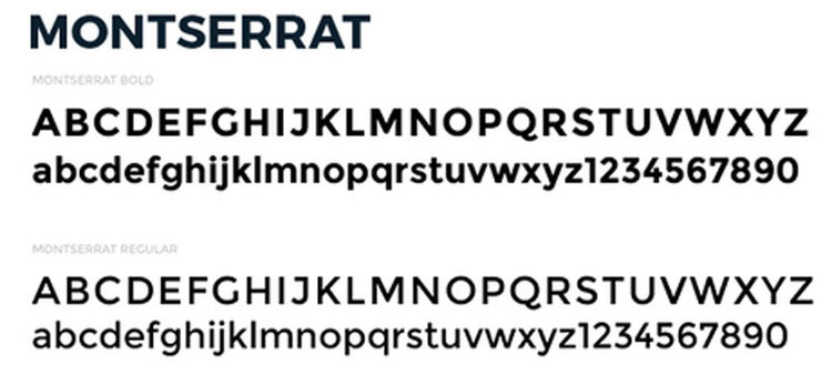
There are three typefaces that make up the fonts of Boston.gov, and they each have their own story.
Berthold Akzidenz Grotesk, with origins dating back to as early as 1880, commands authority and attention. This typeface is used only for our logo. You can see an example of it at the top of this post.
Lora, a contemporary serif developed by Cyreal with roots in calligraphy, will be used across the site.
Montserrat, developed by Julieta Ulanovsky, appears strong and official, but the sturdy sans-serif typeface has a few quirks that give it a friendliness.
As we continue to develop and build out Boston.gov, we’re always keeping in mind that our goal is to create a more personal experience. We hope our balanced mix of colors and typefaces helps us deliver that official but human tone.


