Creating a user-friendly way to find neighborhood resources
With the help of a General Assembly group, we’re fine-tuning our designs for a popular legacy application.
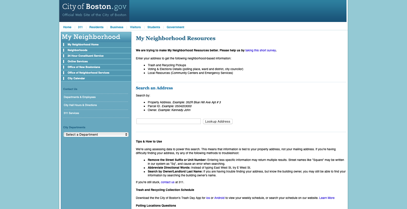
Nearly three years after launching Boston.gov, we’re still working to bring over some of our old, legacy systems. One of those is our My Neighborhood Resources tool. While it’s a bit old and outdated, the app is still very useful, serving up info for residents based on their addresses. And, it’s well overdue for a Boston.gov makeover.
With the help of one of our summer fellows, we were able to do some research into the application and the type of users interested in it. While we had some initial prototypes, we weren’t able to test them as much as we would’ve liked with our users. Before we dove into the technical side of things, we wanted to make sure we were building an application that was easy to use and understand.
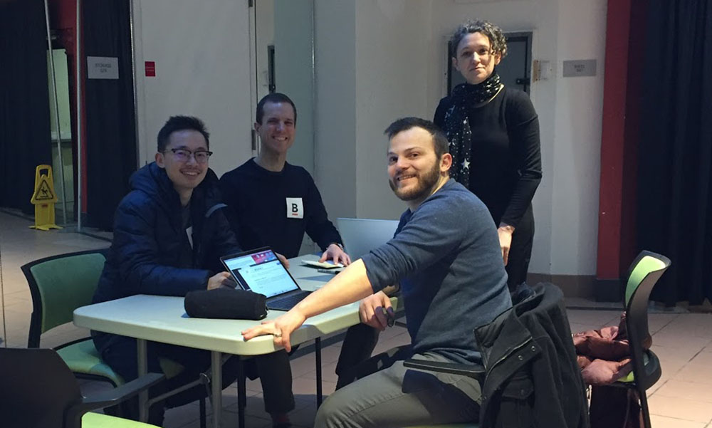
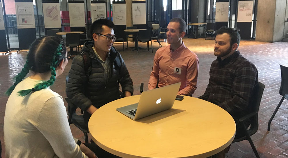
We decided to leverage our relationship with General Assembly to work with a user experience cohort on prototyping new designs for the app. The blog post below was written by the students about how they prototyped designs for a new version of the app.
Getting started on the project
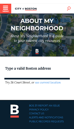
At our kickoff meeting, the Digital Team asked us to redesign an address search application called My Neighborhood Resources. This application is hosted on the City’s old website, cityofboston.gov. Before the team migrated the tool to the new City website, they wanted to make sure they were creating a user-focused application. The app gives residents information based on a property or location of interest in the City. We felt inspired by the idea of helping thousands of City residents quickly find nearby resources and services on Boston.gov.
Our task was to build upon research and testing previously done by a former summer fellow at the City of Boston, and provide some closer-to-final designs. We were specifically asked to think through what information — and how much of that information — should be displayed after an address search.
What’s the problem?
At first, we reviewed the initial research done on the app. To better understand the existing design work and get a baseline for our work, we also analyzed the original My Neighborhood tool. We noticed several areas that needed improvement:
- After entering an address, there is a long delay before the results are loaded. Users also need to scroll a long way to see results.
- Search results are often incomplete and/or insufficient
- Fonts and color schemes are not consistent in the app.
Building our design
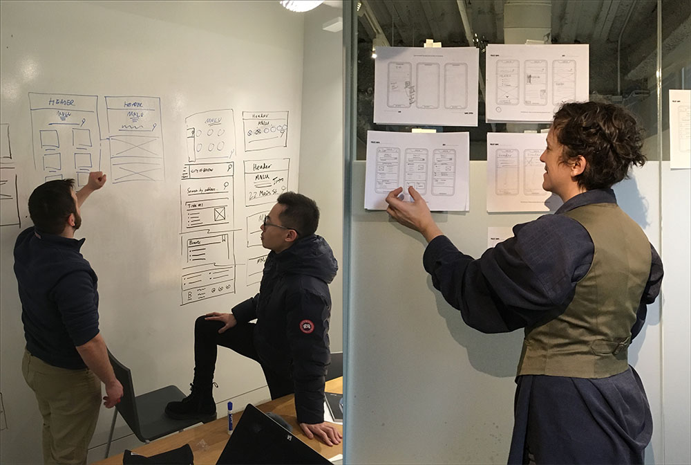
Now that we had a better understanding of the common issues users run into with the app, it was time to brainstorm and ideate. At General Assembly, we learned about Design Studio, a method of trying out many design ideas in a very short amount of time. We decided to take that approach with this project.
During Design Studio, a team chooses one piece of the design — such as the search bar — and each member of the team has one or two minutes to sketch as many versions of it as they can. Then, one by one, the other members say what they like and do not like (in a nice way!) about each sketch, casting votes for their preferences. The elements with the highest totals are kept, and the others are discarded.
For our Design Studio, we considered how two elements should look:
- the landing page with the address search bar, and
- search results, including nearby parks and swimming pools.
Testing, testing
After casting our votes, we turned them into basic, black-and-white designs. We left out colors on purpose. We wanted our users to focus on how the app is working, without being distracted by a color they may or may not like.To make sure we always keep our users’ needs in focus, we work by the mantra, “I am not my user.” Testing apps with users is essential. We want to make sure they are able to find what they need and receive information when they need it. We never want to assume that our design solution is the right one until we have plenty of users confirm our product is, in fact, easy-to-use.
In that spirit, we transferred our designs to InVision. This software is used by designers to create an interactive environment for testers. We may not have all the intricacies of a full-fledged application. But, we can get an idea of how users will engage with that application. In the end, we did six total rounds of user testing with 29 participants.
Reviewing our prototype
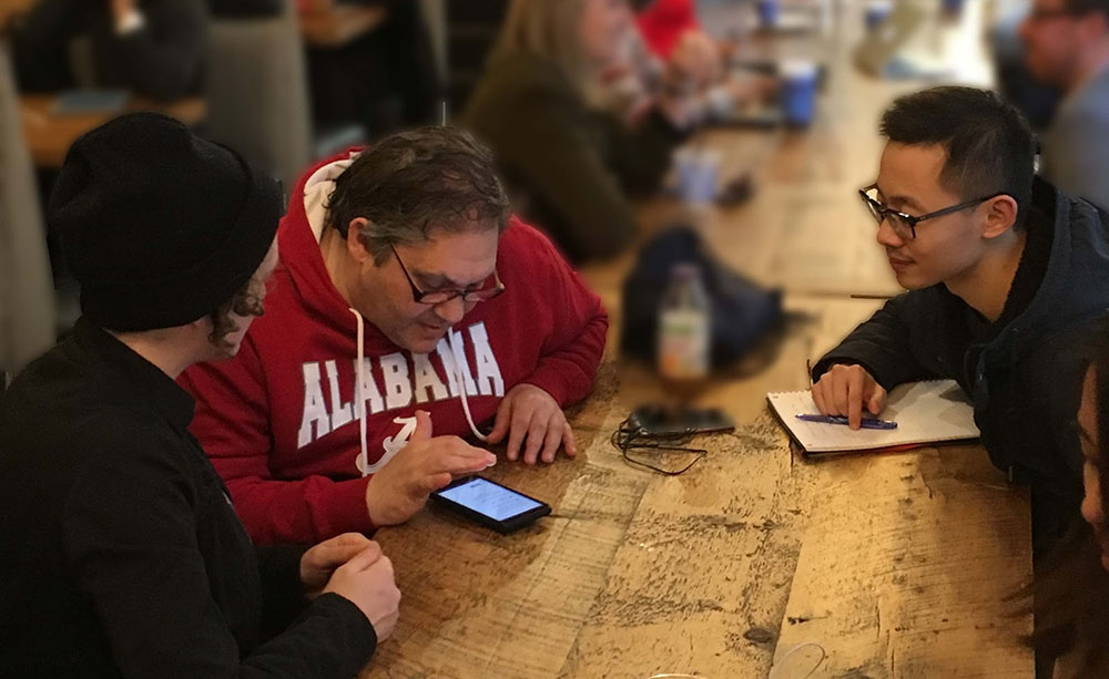
With the test app ready, we hit the streets with our phones to find people who were willing to try it out.
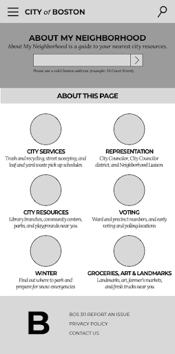
On the landing page — where users would need to enter an address — we placed icons for different search categories. We thought these icons would inspire confidence by giving users a sense of what to expect after they entered an address.
Users, over and over, tapped the icons instead of entering an address. Since the main action required of users was to enter their address, we needed to more directly lead them to do this. In other words, we had to simplify the design and not create a situation where they needed to think.
Back to the drawing board
To make the search field more visible, we decided to delete the icons. After identifying and removing the main obstacle to use the app, we added color to make the app look more like a finished product. By aligning our design with the City of Boston’s brand, we thought users would feel even more willing to use the app.
For the next round of testing, we set up ourselves up at City Hall near the Registry and Parking Clerk offices. We waited until residents finished whatever they came to City Hall to do before asking if they would be willing to give us some feedback.
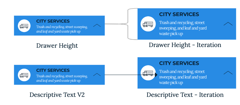
If I have low eyesight, italicized text would be a little hard to read.
During this round of testing, some initial feedback we heard was around folks having trouble reading the text. Obviously, we want this app to be used by as many residents as possible, so accessibility issues were a top priority. To make the text easier to read, we increased the width of the category tab to add space, and changed the type from italics to regular.
Round three of tests
With our last round of edits made, we went out back out into the community again, this time to the Boston Public Library’s Chinatown branch. We received great feedback from residents dropping off books, or just hanging out on their lunch break.
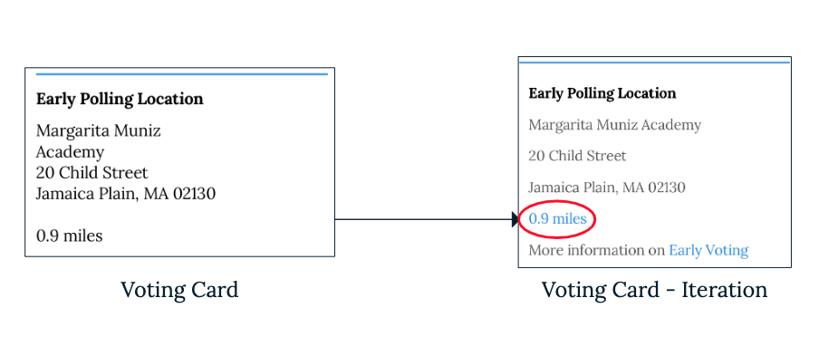
Would be nice if it links to Google Maps or a map in general.
Throughout our testing, users told us that they expected to see and use maps in the app. At this point, the use of GPS and navigation has become ubiquitous with modern applications. With that in mind, we decided to mark where map links would appear in the search results by highlighting the text in blue.
Final stop: desktops
Up to this point, we’d taken a mobile-first approach to our designs. It’s a lot easier to work on the kinks on mobile and then transfer that experience to larger screens than vice versa. With many rounds of testing on mobile under our belts, we felt comfortable working on new designs for laptop and desktop screens.
The major difference, of course, is that laptop and desktop screens allow more space to be creative with different features. In one sense, this is can be liberating. However, the reflexive decision to just add more can also be dangerous. Too much noise prevents users from getting things done.
“I want to jump around the page.”
We returned to City Hall one last time for an intensive afternoon of testing. When testing our designs on desktop screens, we noticed users getting “stuck.” When they ended up on a part of the page where they needed to backtrack by scrolling, they often felt trapped. To address this, we added a “sticky” navigation bar at the top of the page. This feature gives users the option to jump from one section to another no matter where they are on the page.
In closing
Helping to redesign the My Neighborhood app for the City of Boston was an absolute pleasure and privilege for our team. We hope our work helps to make Boston.gov a little easier for its users to navigate, and a little more delightful, too.
About the General Assembly team
General Assembly offers accelerated courses for in-demand skills in tech. The students we worked with were part of the Winter 2019 User Experience Design Immersive. Their work on the neighborhood resources application was a final project that they completed over three weeks. We are incredibly grateful for their participation with us, professionalism, and actionable findings. The students who took part in the project were Matt Weston, Elle Troeger, Weinan Li, and Rick Aborn.

