Visualizing delays on Boston bus routes
Sinclair Target, a 2019 summer fellow on the Analytics Team, explains his summer project analyzing Boston bus routes.
Where do Boston buses get stuck in traffic? Where do they sail along? If we knew more about how buses travel across the City, could we make bus service better for everyone?
The City of Boston does not have direct control over the bus system in the greater Boston area. The bus system is run by the MBTA, a state agency. But, the City does have control over the roads and intersections throughout Boston. We need to make sure that roads and intersections are designed in a way that keeps buses moving along their routes.
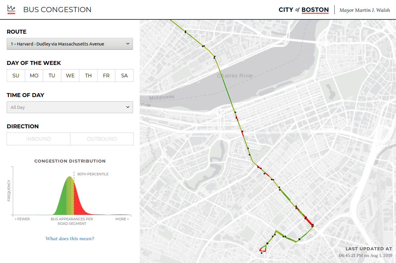
As part of that effort, the Boston Transportation Department wanted to know where buses were running into trouble. This summer, I was able to use GPS data published by the MBTA to create a heatmap visualization of bus delays. This interactive map will help the Transportation Department find and redesign the intersections that are slowing buses down.
While building the visualization for the heatmap, I ran into a few interesting problems.
How to measure speed?
Every MBTA bus is fitted with a GPS tracker. The MBTA provides an API that you can use to find the location of any bus in real time. Unfortunately, you cannot use the API to find out anything about speed. So how can we determine where buses are getting held up using only data about their location? I decided not to visualize speed at all. Instead, what my visualization shows is where buses are most likely to be found at any given time.
It might not be immediately obvious why this is a workable substitute for speed. But imagine a bus traveling back and forth along Route 1, which stretches from Harvard Square in Cambridge to Dudley Square in Roxbury. Perhaps it travels slowly along Mass. Ave., where there is lots of traffic, but quickly across the Harvard Bridge over the Charles River. If you had a pencil and a map of Boston, and every five minutes you noted the location of that bus by drawing a little dot on the map, after a day or two you would start to notice that Mass. Ave. has accumulated a higher density of dots than Harvard Bridge. The bus travels more slowly along Mass. Ave., so it spends more time there, and you’ll find it there more often.
This is how my visualization works. I've built an automated data pipeline that pulls in GPS data from the MBTA's API every five minutes. I then use that data to show which streets have accumulated a high density of dots.
How high density is 'high density'?
I wanted the "high density" congested streets to be an angry red color in my visualization. But I realized that I had no clear definition of "high density."
I was tempted to use an absolute cutoff. For example, I thought about making every street where buses had appeared more than a certain number of times a "high density" street. The problem with that approach, though, was that it would make the busier bus routes — the ones simply running more buses — look more congested than the less busy bus routes. What I really wanted to visualize instead was where each bus route was congested relative to the rest of the same bus route.
In the end, I chose to color each street based on how much of an "outlier" it is, in terms of bus appearances or dots, when compared to the mean across all streets in a bus route. The red streets in my completed visualization are streets that are well above the mean for the bus route. In fact, they are in the top 20 percent of "bad" streets across the City.
Lessons learned
My summer fellowship with the Analytics Team has only been eight weeks long, but in that time I've learned so many new things. I've developed new technical skills. Before working on this bus route project, I had never used PostGIS, a tool that allows you to express geospatial concepts in your database queries. Now I know more about complex PostGIS queries than I could ever want to know. I've also learned a lot about how Boston City government works and how departments at the City collaborate to improve the lives of Boston residents.
If you are thinking about becoming a summer fellow, I encourage you to apply! You'll have an opportunity to learn from some wicked smart data engineers and analysts, of course. But, you'll also have an opportunity to talk to City employees throughout City Hall. The fellowship gives you a behind-the-scenes look at how municipal problem-solving happens here every day.
This blog post was written by Sinclair Target, a 2019 summer fellow on the Analytics Team. He’s an MS Candidate in Computational Analysis and Public Policy at the University of Chicago. Check out his website, or connect with him on LinkedIn. Applications for our summer fellowship will open up again in the new year.


