Creating accessible information for returning citizens
We’re working to provide information that makes it easier for people to get back on their feet.
When the Digital Team creates tools and services, our focus is on everyone. We want to build experiences that are accessible to as many people as possible. But, in some cases, we work on projects where our target audience is smaller and much more specific. That’s definitely the case with our efforts around the Mayor’s Office of Returning Citizens. The office supports those who return to Boston after being released from state, federal, and county jails and prisons each year. They also help those who were previously incarcerated.
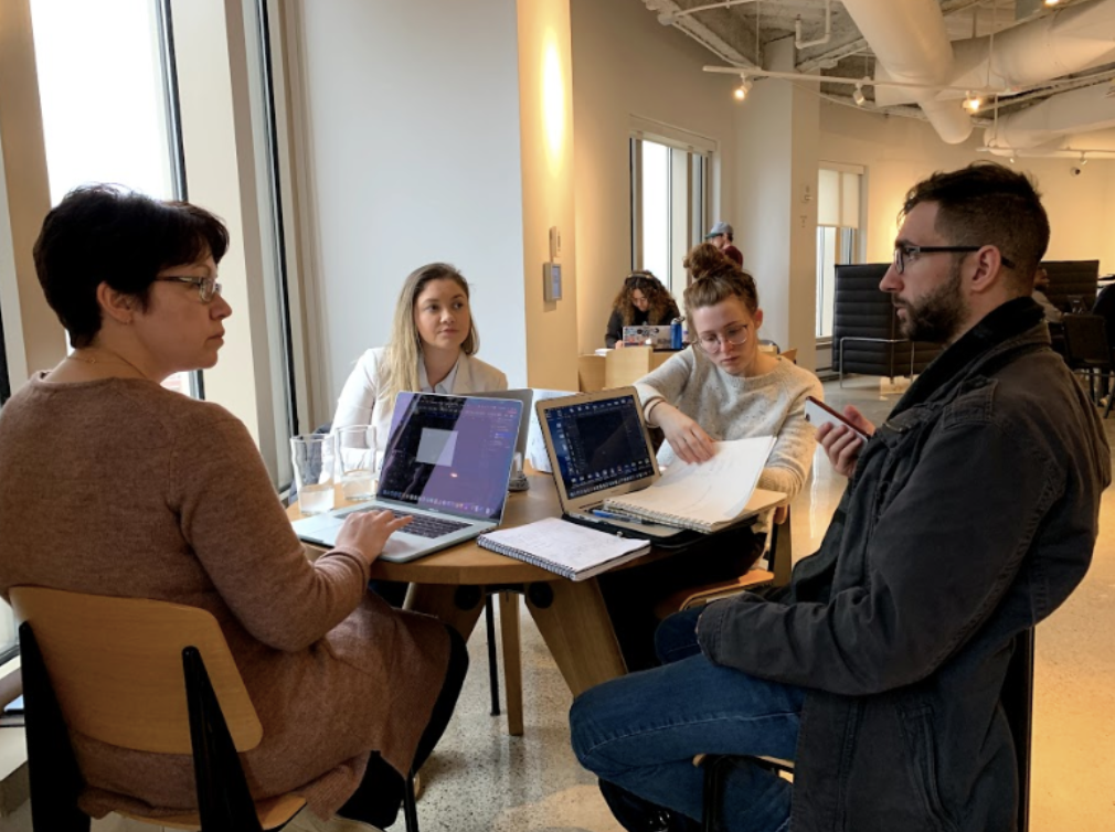
The people Returning Citizens attempts to reach often face challenges different from those encountered by the general public. To get a better understanding of how these folks would like to connect with important resources through Boston.gov, we teamed up with one of our local partners, General Assembly. They tasked a cohort of students in their User Experience Design Immersive with figuring out how to create a better experience for them on Boston.gov. The blog post below was written by the students about their experience.
Jumping into the project
To get started, we held a kickoff meeting with the Digital Team and the Office of Returning Citizens. Returning Citizens was established in 2017 to support the re-entry of individuals coming out of incarceration. Our goal was to first understand the needs of people who are facing re-entry. We then used what we learned from that research to propose a redesign of their presence on Boston.gov.
At the time we started working on the project, their site functioned more like an “about” page explaining the office. We saw an opportunity to create a page that acts like more of a support platform to directly point returning citizens to the services they may need. We were inspired by the fact that our design decisions could support a community member’s re-entry goals.
Conducting the research
In just one week, we interviewed 14 people, each navigating a different phase of the re-entry process. These interviews were conducted at the Returning Citizens office and at the Suffolk County Sheriff’s Department. The first part of our interviews focused on learning about each person’s:
- re-entry experience
- the goals they are pursuing, and
- challenges they have encountered.
The second part of our interviews focused on the current webpage. Each person provided feedback on what they would expect and like to see.
Aside from interviews, we also performed a comparative analysis of other local government offices in the United States that have the same mission as Returning Citizens. We looked at relevant websites for eight different offices and compared different elements on the pages, including:
- the major tasks that could be performed
- ease of navigation, and
- the visual layout.
We would later leverage some of these elements within the design we proposed.
Understanding our users
After talking with our users, we synthesized our data by grouping like concerns together to point out user needs and pain points. We then used an exercise called affinity mapping to identify the major challenge areas of our primary users. From this exercise, we defined the themes of our primary users as:
- having limited to no access to technology (making a phone call could be ‘it’, at first)
- feeling overwhelmed about adapting to life outside of an institution, including by technology
- knowing they need to come up with a plan to keep them from going back to an institution, but often with limited to no means or resources, and
- hearing about the Office of Returning Citizens through word-of-mouth only after they were released.
We found that the majority of our primary users faced challenges with technology. We realized that we could not assume people have access to the Returning Citizens homepage. We proposed two solutions:
- one to cater to individuals with limited fluency and access to technology, and
- the other for individuals who have a better grasp of, and easier access to, technology.
As part of our work, we also defined a secondary user. Our research showed family and friends are using the page for information as well. We needed to make sure the solutions we designed spoke to them.
Design solution evolution
After finalizing our research data and identifying our user needs, we came up with specific design features. If a proposed design feature fit more than one user need, we made sure to include it. This helped us narrow our scope to get to the key points addressed in our project. We set out to do a timed design studio. Our goal was to flesh out ideas and create a visual representation of designs that we could test with users.
Usability tests allow us to view how screens flow with one another, and how users naturally interact with the design. We can figure out pretty quickly what works and doesn’t work as a user goes through this flow. Many of the users we spoke to just wanted to see one of three things:
- what services they can get help with
- who would help them, and
- who to call for additional help with the overall process of re-entry.
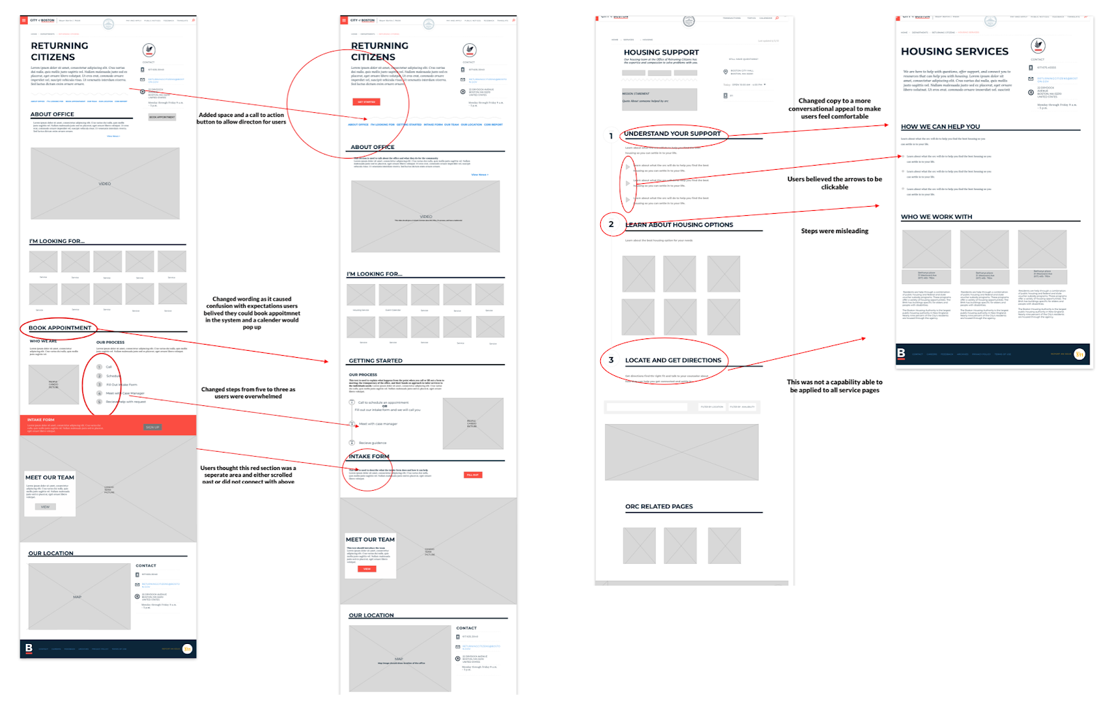
Simplicity was key in our design. We created one page with all of our user needs provided as links on the page. In a section titled, “I’m looking for…”, we placed relevant information in buckets that would jump users to pages with more detailed information. We also made sure that a general intake form was easily accessible for users.
Keeping in line with the City of Boston’s brand guidelines, it was critical for us to keep the wording conversational and easy-to-understand. Where we could in our designs, we also created a “step” system that guided people through what process they needed help with. We felt this type of design would help with trust and overall goal planning.
Unfortunately, our project ran out of time before we were able to test out our new designs on users. But, we feel that we’ve laid the foundation for City staff to continue these efforts.
Where we landed
With just three weeks to work on this project, we found that balancing expectations and adapting to changes were key learning points for our team. We were also continuously amazed and enlightened by the courageous efforts of those who work each day to help those affected by incarceration.
We would like to thank those we spoke to who helped us gain insight into the Office of Returning Citizens and the re-entry journey. We were humbled and reminded of how much we take for granted in terms of access to information.
ABOUT THE GENERAL ASSEMBLY TEAM
General Assembly offers accelerated courses for in-demand skills in tech. The students we worked with were part of the Spring 2019 User Experience Design Immersive. Their work on Returning Citizens was a final project that they completed over three weeks. The students who took part in the project were Jenn Andersen, Cindy Matos, Lydia Gamache, and Perry DeNicola.


